
Experimental idea 1
Experimental idea 2
Experimental idea 3


final piece
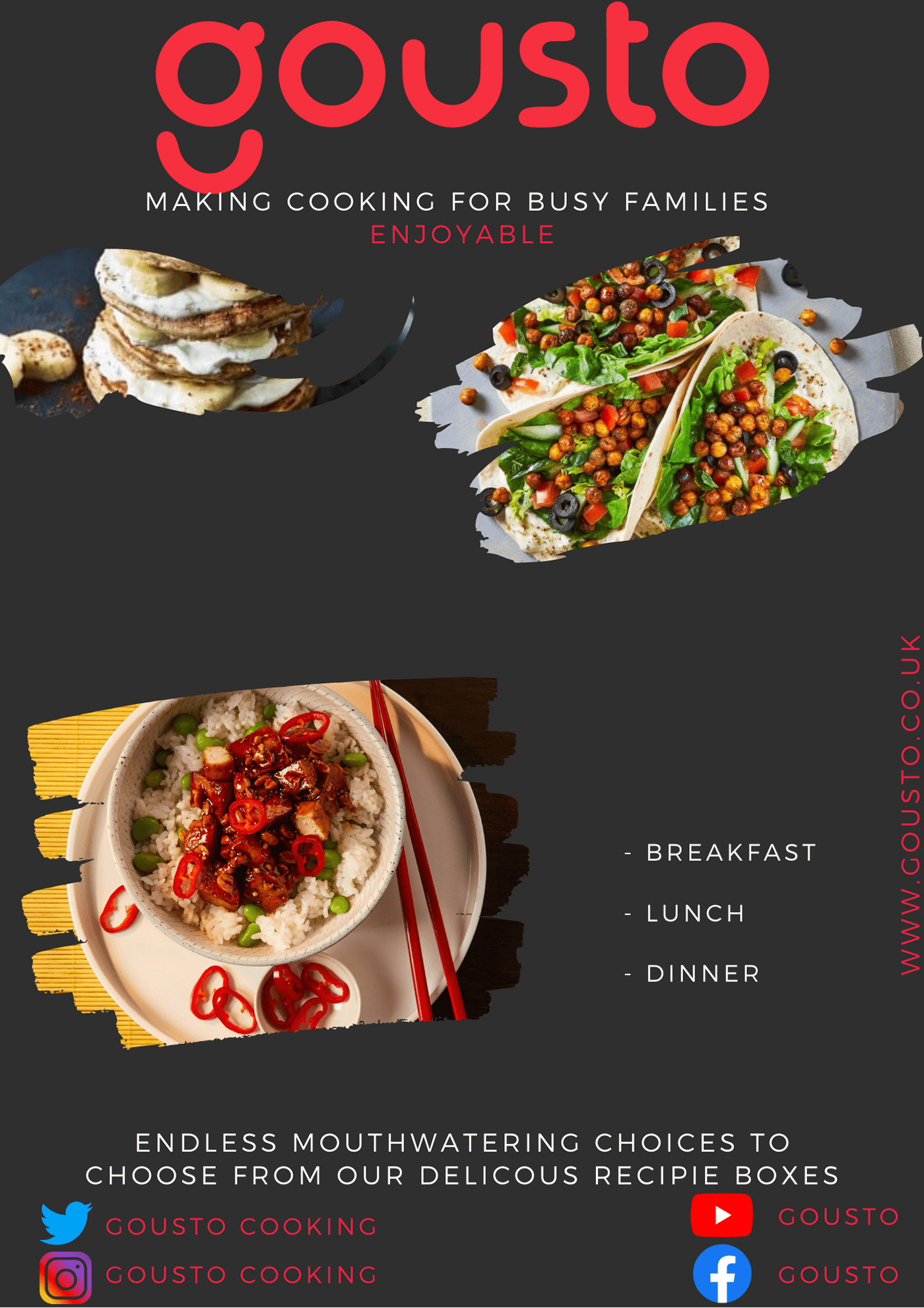
Gousto is a British is a meal kit retailer that provides their subscribers with fresh ingredients and easy to follow recipes, with their target audience ranging from 20- 35-year-olds some are likely to be starting up a home and a family with young children and teenagers. With the easy-to-follow recipes provided by the company practically anyone can cook. With that being said the thought process behind designing this poster was simple yet effective. With a minimalist design I was able to incorporate key images as well as copy to inform the customer an inviting link to the website can be seen this will allow there to be an increase in web traffic in addition to this links to their social media can also be found which will assist in social media engagement numbers. In addition to this, I was also able to successfully incorporate a link to the Gousto beats Spotify account as well as a well-written slogan that links both companies at the same time. In my research I was also able to find a Gousto YouTube channel where they cooking tutorials, adverts and testimonials, I believed that integrating the YouTube link on to the flyer would evidently create more subscribers and web traffic, this will of course help contribute to the company goals being achieved at the same time.
The use of copy will be a deciding factor although I had experimented with some designs, I decided to keep the colour scheme of the company name the same when mentioned the slogan has the word “enjoyment” in red this is actually the literal translation from the Italian word “gusto” which highlights the company’s aim to make cooking fun and enjoyable.
Spotify was highlighted in green as that is what the company uses in their colour scheme this allows to be easily identifiable as a collaborating company.
To lay out this flyer I used the Gutenberg diagram which follows a “Z” like formation which consists of a primary optical area (the area and surrounding area of the title), followed by a strong fallow ( the main body or mid-section) the week fallow and finally the terminal area ( the call to action to do something) it is common knowledge that we unconsciously process information from a page in a “Z” formation or a “zig-zag” formation in light of this knowledge I was able to place key images as well as copy to entice the consumer.
The images used were all from the company website reason being is so that consumers can see the quality of what they are looking at a list of breakfast, lunch and dinner was also implemented into the flyer informing the customer of what is there to choose from.The subtle use of hyperbole was also incorporated to make the potential customer feel like they can pick and choose what they like and how they would like their meals this would be an easy trigger for the stages of buyer decision to take place.
The images used were all from the company website reason being is so that consumers can see the quality of what they are looking at a list of breakfast, lunch and dinner was also implemented into the flyer informing the customer of what is there to choose from.The subtle use of hyperbole was also incorporated to make the potential customer feel like they can pick and choose what they like and how they would like their meals this would be an easy trigger for the stages of buyer decision to take place.

